

Hello Krafty Friends! Krafty Girl Danielle C here today to share with you a tutorial on how I colored a magical out of space sky.
the stamps sets I used for this card were:
(sentiment) Party Time Sentiment
and the Star Burst Stencil which will soon be back in stock.
You will need the following inks:
Stormy Sky
Magical Midnight
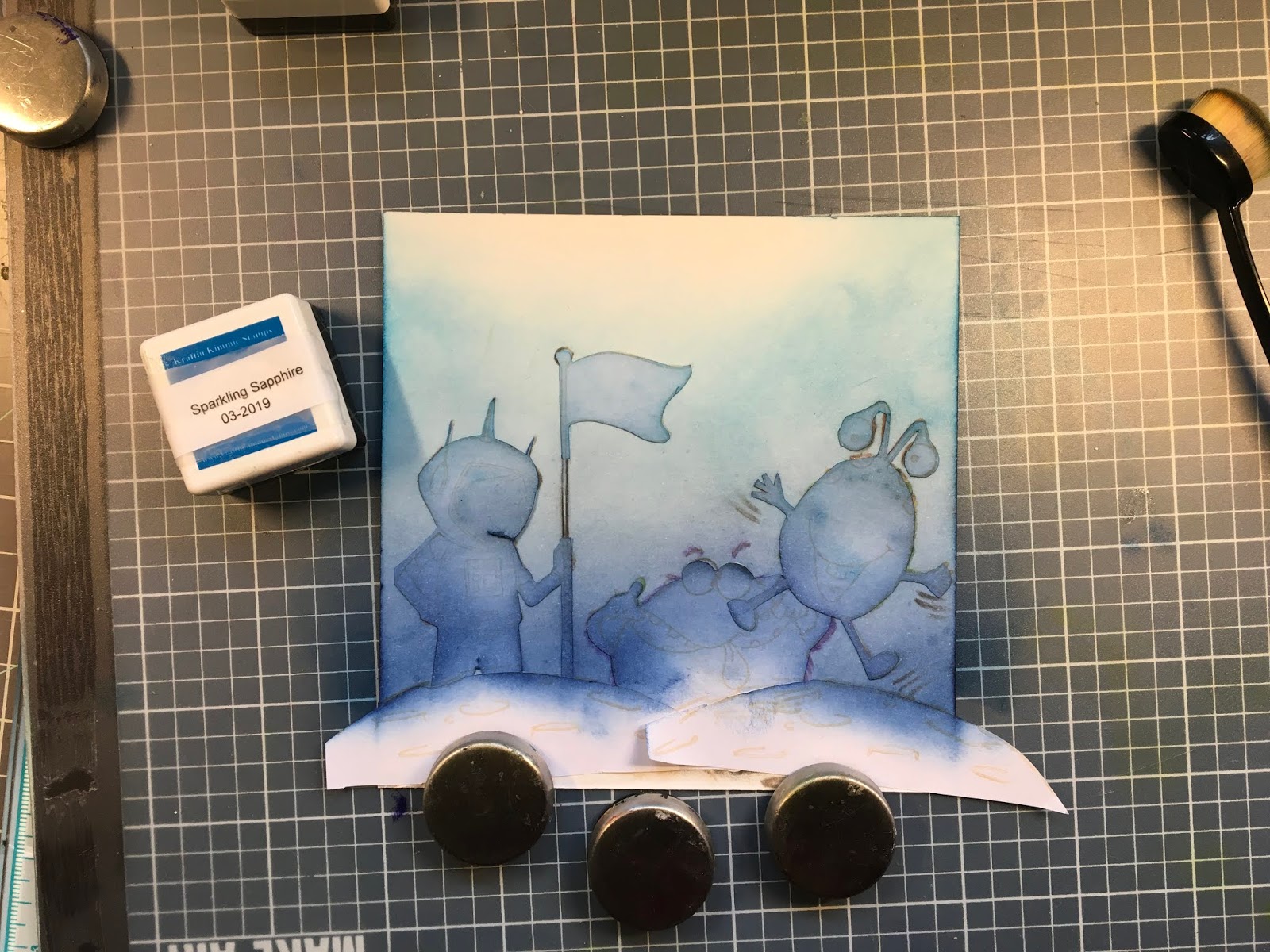
Sparkling Sapphire
Bubbly Blue
I mostly use brushes to get the subtle pastel look.
I used gloss heavy gel to which I added lots of glitters with the stencil.
My first step was to stamp all my images, make masks for each of them. I usually color my images first, and do my background after, but you can choose to do otherwise, if you feel more comfortable.
Since I fussycut my masks, I make sure that they are positioned slightly behind the line of the image, this prevents leaving a white space between the image and the background, especially when the image is already colored.
I would like to draw your attention on the paper you will be using to stamp your images. Each paper has its own particularities. The intensity of the color obtained with the ink might be different depending on the type of paper. In the following example, I have used Bristol Velum, as it is my favorite color for crayons. Bristol velum is a heavy weight paper, perfect for dry media, because of this, it will take me more coats of ink, especially with brushes which tend to spread lightly. this is a matter of personal choice, as I have more success with brushes than sponges!
I would like to draw your attention on the paper you will be using to stamp your images. Each paper has its own particularities. The intensity of the color obtained with the ink might be different depending on the type of paper. In the following example, I have used Bristol Velum, as it is my favorite color for crayons. Bristol velum is a heavy weight paper, perfect for dry media, because of this, it will take me more coats of ink, especially with brushes which tend to spread lightly. this is a matter of personal choice, as I have more success with brushes than sponges!
Inking: I start with my darkest color, Stormy Sky, applying ink in thin coats with the brush, in vertical strokes, as I don't want any texture in my sky so close to the planet and characters. I will repeat until I get the desired intensity.

My second color will be Magical Midnight, which is a slightly lighter shade of blue. I will overlap my first color to blend nicely, extend further up, ending very lightly, cause my next color will not be such a deep blue. I will repeat until I get the shade I want,

Next color will be Sparkling Sapphire. I suggest to brush thoroughly on an extra paper to remove the dark pigments of previous colors, if you do not have extra brushes. For this color, I will make my strokes round to create a vaporous effect in the sky, as I am going further upin the background. Again, I repeat until I get the desired intensity, overlaping on the previous blue to blend nicely.
Finally, I will apply my last color the very pale Bubbly blue, overlapping the Sparkling sapphire. I have a brush dedicated for this blue, as it is so light I do not want it altered. If you don't have an extra brush, again, make sure you clean the previous color, or use a sponge, as I showed in the picture.

I made the starry sky, a few stars at a time, repositioning the stencil where I wanted big stars, medium size ones, or tiny ones, making sure that they were dried before I made another batch.
When I finished my stars, I applied another layer of ink, to emphasize the blue sky.

and voilà the end result. You can use this technique creating different intensities. I love creating a vignetting around my images, by using my darkest blues and brushed the corners and the upper part of the image. It gives a sense of bringing everything together. Of course, I applied Stickles all over the image!

Thank you for letting me share this coloring tip with you. I hope you have enjoyed the process! and that it will give you pley of ideas to create fun backgrounds!
Stay safe and Kraft a lot!
Happy Coloring!

LOVE this. I have been using sticky notes for masking, but it doesn't work well for ink blending backgrounds. I need to get some actual masking paper for sure!
ReplyDelete