Showing posts with label Krafty Tips & Tutes. Show all posts

10 May 2021

Krafty Kolour Along - Together is Better!

 Hello everyone! Krafty Girl Delphine here today to share a Copic colouring video tutorial, featuring one of our 2021 Krafty Komebacks - TOGETHER IS BETTER! Hard to resist such cuteness <3! 

Here is my final card:


I stamped my Lulu in Wicked Black Hybrid Ink and coloured her in Copics. I then die cut my image and added a few touches of gel pen here and there. I stamped a sentiment from the Together is Better set and added it to my card on foam squares.

You can see the colouring process from start to finish below:

Here is a recap of the markers I used:
Skin: BV00, E11, YR000, 00
Hair: E49, 59, YR23
Clothes: W1, 3, 5, R11, 32, 35
Balloon: RV02, 04, 95
Ground: W1, 3
Background: R11, RV00

Thanks for stopping by! Have a nice week! Hugs,
Delphine xx

15 March 2021

Krafty Kolour Along - Gnome Greetings

 Hello everyone! Krafty Girl Delphine here today to share a Copic colouring video tutorial featuring GNOME GREETINGS - our stamp of the month for those of you who place an order of $75 or more before shipping/tax!

I decided to colour him in no line and here is the final card:

I coloured everything in Copics, only added a touch of pencil for the eyes and stems. The DPs I used are by Bo Bunny.

You can see the colouring process from start to finish below:


Skin: E000, 00, 11, 71
Hair: C1, 3
Red: R35, 37, 59, W7
Blue Shirt: B93, 95, 97
Shoes: W5, 7
Grass: G28, YG01, 03, 17
Sky: B000, 00

Thanks for stopping by! Happy shoppin' and colourin'! Hugs,
Delphine xx

09 November 2020

Krafty Tips & Tuts: Making a Scrapbooking Layout

 Good morning everyone!

Welcome to a new Tips & Tuts. Krafty Girl Melany here with a picture by picture scrapbooking layout process. I hope you'll follow along with me. Sit back, grab a drink and a pair of scissors, and let's go!


First, I chose my stamp set and a collection to work with. It helps me to pick colors for my stamped images. Today, I'm playing with the TRENDY TEES ICONS stamp set.

I will use these icons to make a stitched banner that will decorate my layout


I cut some small images to add to the banner and to the layout


I outlined the small tags to make them pop

Time for the banner:
a) on a piece of tissue paper, I glued the icons. This will help on the stitching phase


b) Stitching with the sewing machine


c) Removing the tissue paper behind the banner (I must admit that this step was a kind of a pain in the butt! lol!)

Here's a fun banner to decorate your layout!

I chose this Crate Paper polka dotted paper for my background. I think it adds to the whimsy of my icons banner

Adding some mats under the pictures to make them pop

I "cheated cut" my pink paper to make it look bigger!

I popped up one of my photo with fun foam

My base is done. Time for smaller paper details
a) I stamped the "ROCK ON" icon on a fish tail banner. It will add a fun detail to one of my pic

b) I cut the top left corner of my page to add a touch of color and 2 tags to bring your eyes to the banner

c) I added some fussy cut books to add some details on the left side and a small tag on the main pic

Since I don't know what to do with the down right side of the layout yet, I decided to work on my title while I'm thinking about it

a) I always put my title on wax paper, so I can move it around to see where I want to put it

b) I decided to put my smaller word on some tags to ground it. I machine stitched it to add some texture

Here's what I've decided to do with my down right corner. I tried to add all of the 3 main colors and sewed the cluster. Now, I have a nice diagonal of sewing: the banner, the title and the down cluster

Time for smaller "non paper" embellishments. I went very simple with only 1 puffy sticker, white twine and the teal dots from the POLAR DOTS to bring a bit more of the teal that's in the little flower from the banner. I outlined the dots to make them pop


And now, here's the final result! I can't wait to see your take on this layout!

Have a very nice day!

12 October 2020

Krafty Tips and Tuts - Colour a simple winter scene... and Santa!

 Hello everyone! Krafty Girl Delphine here today to share a Copic colouring video tutorial :) I thought I would share how to create and colour a simple winter background and also a Santa since it is time to get ready to create those Christmas cards - time flies!!

Here is my final card, featuring the DEAR SANTA stamp and a beautiful sentiment from the HOLIDAY WISHES stamp set:


I stamped the Santa from the DEAR SANTA set in WICKED BLACK Hybrid Ink and die cut my image with a Lawn Fawn die. I then coloured everything in Copics and added the sentiment from the HOLIDAY WISHES stamp set once everything was coloured, plus a few touches of white gel pen.

You can see the colouring process from start to finish below:


Background and snow: B000, 00, BV000, 00
Trees: YG17, G21
Skin: E11, 71, YR000, 00
Beard: C0, 1, 3
Red: R35, 37, 59, W7
White on outfit: W0, 1, 3
Glove: W5, 7, 9
Dog: E40, 41, 43

Thanks for stopping by and happy colouring! Hugs,
Delphine xx

07 September 2020

Krafty Tips and tutes - Create a magical scene


Hello Krafty Friends!
Krafty girl Danielle C here today, to share with you an idea on how to create a scene with
multiple overlapping  stamps without too much fuss!

I used Owl-Chemy stamp set
and you will need the following supplies:
A stamping platform
2 coloring paper (I used bristol velum) - identical size
mask paper ( I used Eclipse and Post it full stick notes)


Step 1. 
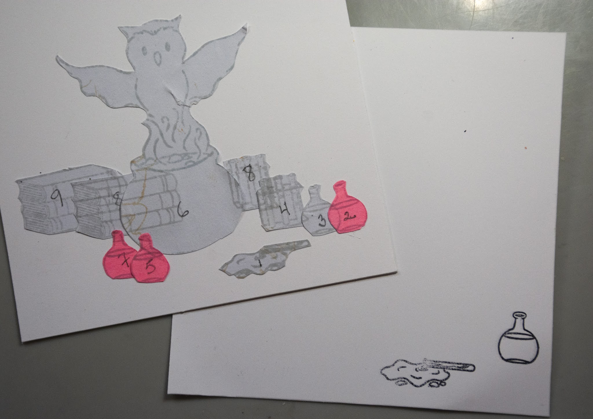
Stamp masks of each element you would like to include in your scene, 
make double for the elements you want to use twice. Fussy cut all elements.

Step 2.
Create your scene, by positioning your masks as you wish.
Number all elements, starting with the fist one to stamp, which means the ones that will stand in front of one another.
In my scene, you  will notice that element No. 1, is alone. 
Elements no. 2, 3, 4  will overlap. 
Therefore element 2 will be the first one to be stamped.
Same on the left of the picture, with elements 5 and 7, which are closer to you, 
thus the first ones to the stamped.
Your image will look somewhat like this.


Step 3
Image No. 1 is in front, and not touching anything, so I will stamp it first,
What I do is I position my paper withe the scene I creatred on the stamping platform,
put the corresponding stamp on top of the mask,
and close the lid to grip the stamp.
then, I will replace the cardstock with the one I will be stamping on,
positioning it exactly at the same place as cardstock with masks.
then I will repeat with image stamp No. 2.


This is what I get when images are stamped.


Step 3.
 I will proceed with image no. 3 with the same technique, 
and cover it with the mask, before I do image No. 4 and 5, on the left.
This what my sample image will look like when I position my stamps for images 4 and 5.


This is what I get, I will then cover my printed images with masks to proceed further.


Step 4
We will now stamp the main image, No. 6. and the no. 7 bottle
preparing the stamp with the same technique as above,  this is what we get.


Step 5
Now, let's get ready to stamp the last images, No. 8 - I have two images No. 8, one at the left (books)
and one at the right ( test tubes holder), they will be stamped together. you see here, the result.


Step 6

The final set of booksl No. 9, stamped over the first set, close to the pot.


The image after removing all the masks, ready to color!


Don't forget to save all your masks,
I stick them on my stamp set for futher use.


Thank you for letting me share a little stamping tip with you today!
Hope it will come handy and gives you inspiration to create scenes with this lovely set,
and others from our collection!
Stay safe and kraft a alot!
Happy Krafting. 


20 July 2020

Krafty Tips and Tuts - No Line and 2 Videos!

Hello everyone! Krafty Girl Delphine here today to share TWO video tutorials with you! For the Krafty Peeks of our July Release, I posted a card using the LONG IN THE TOOTH stamp set - the one you can see below :


Some of you asked me about the background, so I thought I would share how to create the clouds and colour the sea and waves in Copics (Video 1). I stuck to this original card but decided to add a twist and create the scene in no line this time, so you can also watch how I colour the walrus in no line (Video 2).

Here is my final card : 


To create the waves, I drew in pencil using my KRAFTY SCENERY 3 stencil as a guide.

I did not speed up the videos too much, so you can still follow and reproduce if you want to.

VIDEO 1:


VIDEO 2:


Sky: B0000, 000, 00, 01
Sea: B01, 05, BG02, 09
Walrus: B63, E40, 41, 42, 43, W0, 2, 4, 6

Thanks for stopping by and happy colouring! Hugs,
Delphine xx

08 June 2020

Krafty Tips and tutes - A magical outer space sky


Hello Krafty Friends! Krafty Girl Danielle C here today to share with you a tutorial on how I colored a magical out of space sky.
the stamps sets I used for this card were:
and the Star Burst Stencil which will soon be back in stock.

You will need the following inks:
Stormy Sky
Magical Midnight
Sparkling Sapphire
Bubbly Blue
I mostly use brushes to get the subtle pastel look.
I used gloss heavy gel to which I added lots of glitters with the stencil.


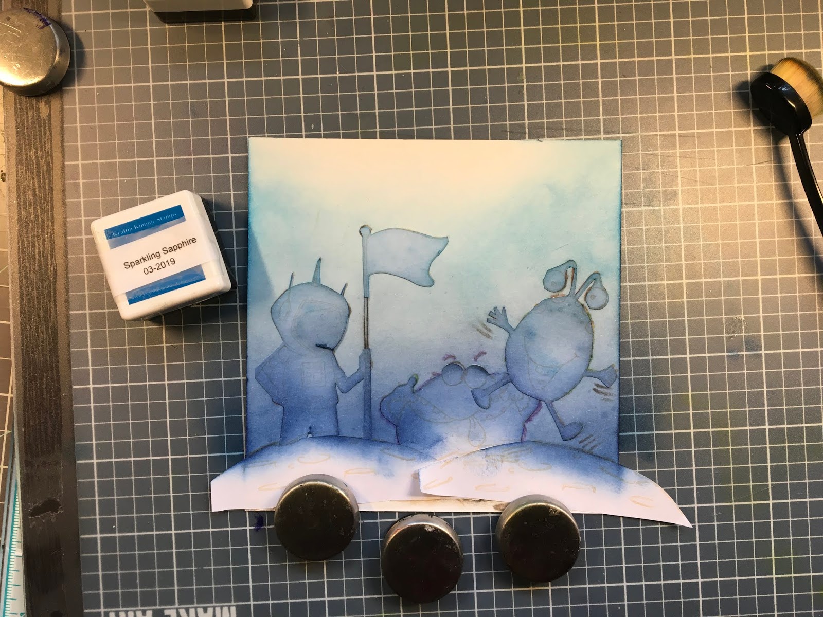
My first step was to stamp all my images, make masks for each of them.  I usually color my images first, and do my background after, but you can choose to do otherwise, if you feel more comfortable.
Since I fussycut my masks, I make sure that they are positioned slightly behind the line of the image, this prevents leaving a white space between the image and the background, especially when the image is already colored.
I would like to draw your attention on the paper you will be using to stamp your images. Each paper has its own particularities. The intensity of the color obtained with the ink might be different depending on the type of paper. In the following example, I have used Bristol Velum, as it is my favorite color for crayons. Bristol velum is a heavy  weight paper, perfect for dry media, because of this, it will take me more coats of ink,  especially with brushes which tend to spread lightly. this is a matter of personal choice, as I have more success with brushes than sponges!

Inking:  I start with my darkest color, Stormy Sky, applying ink in thin coats with the brush, in vertical strokes, as I don't want any texture in my sky so close to the planet and characters. I will repeat until I get the desired intensity.


My second color will be Magical Midnight, which is a slightly lighter shade of blue. I will overlap my first color to blend nicely, extend further up, ending very lightly, cause my next color will not be such a deep blue. I will repeat until I get the shade I want, 


Next color will be Sparkling Sapphire. I suggest to brush thoroughly on an extra paper to remove the dark pigments of previous colors, if you do not have extra brushes. For this color, I will make my strokes round to create a vaporous effect in the sky, as I am going further upin the background. Again, I repeat until I get the desired intensity, overlaping on the previous blue to blend nicely.


Finally, I will apply my last color the very pale Bubbly blue, overlapping the Sparkling sapphire. I have a brush dedicated for this blue, as it is so light I do not want it altered. If you don't have an extra brush, again, make sure you clean the previous color, or use a sponge, as I showed in the picture.


I made the starry sky, a few stars at a time, repositioning the stencil where I wanted big stars, medium size ones, or tiny ones, making sure that they were dried before I made another batch.
When I finished my stars, I applied another layer of ink, to emphasize the blue sky.


and voilĂ  the end result. You can use this technique creating different intensities.  I love creating a vignetting around my images, by using my darkest blues and brushed the corners and the upper part of the image.  It gives a sense of bringing everything together. Of course, I applied Stickles all over the image!


Thank you for letting me share this coloring tip with you. I hope you have enjoyed the process! and that it will give you pley of ideas to create fun backgrounds!
Stay safe and Kraft a lot!
Happy Coloring!


27 April 2020

Krafty Tips and Tuts - A Sloth Video !

Hello everyone! Krafty Girl Delphine here today to share a video tutorial on how I colour cute sloths and how you can get rid of the white background by adding a touch of colour in a very easy way. 

The stamp set I'm using today is A SLOTHSOME DAY, from our latest release.

I recorded the colouring of the whole card and, even if I sped it up a little, you can hopefully see the way I added colour around the edges of my card using very light-coloured Copic Markers and my two examples of sloths to maybe give you some inspiration to colour yours!


Here is the final card and a recap of all the colours I used :


Sloths : E33/35, Y28, YR30, 31, W0, 2, 4, 6
Branches : E35, 39, 59
Leaves: G24, 28, YG01
Background: BG10, 11

Thanks for stopping by and happy colouring! Hugs,
Delphine xx